Menu Mobile (no User Icon) – How to move hamburger icon left
Move the hamburger icon in the Vehica mobile menu from the right-hand side of the header to the far left, next to the logo, with a short CSS snippet.
1 minute read
This article shows how to move the hamburger icon of the mobile menu to the left.
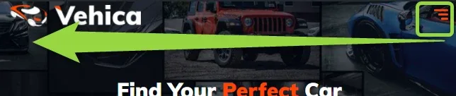
Please add this CSS code.
css
@media (max-width:1200px) {
.vehica-logo {
    left: 60px;
    position: relative;
}

.vehica-mobile-menu__hamburger {
    position: absolute;
    left: 0;
}

.vehica-menu-icon {
    transform: none!important;
}
}
You can read how to add CSS code to all your pages here: How to add CSS code that is future update compatible
Only on narrow screens
The snippet is wrapped in
@media (max-width:1200px), so it changes nothing on wider desktop screens. The left: 60px value on the logo is what keeps it clear of the icon — adjust it if your logo overlaps.It will be displayed like this.

Ask the people who build Vehica
We answer by email from support@tangiblewp.com. With Premium Support, we also fix your site when something breaks.
We can also run your site for you, or build a new one.
Was this guide helpful?