Skip to content

Global Design Management of Colors, Typography, Ad Cards Style, and Many Other Repetitive Elements

Set your colours, fonts, card styles and other repeating design details once in Elementor's Site Settings, and every page of your Listivo site follows them.

3 minute read

Listivo Design Settings provide a comprehensive suite of options to globally enhance the visual aspects of your website. These settings allow you to manage global colors, typography, border radius, shadows, form inputs, dropdowns, buttons, navigation arrows, paginations, and the interfaces for login and register. You can also configure ad cards, which may include customizable fields with optional icons, and elements such as user name, phone number, location, labels, rating, and description. Additional customization options are available for featured ad cards, quick preview popups, blog cards, and package styles for monetization.

Customizing these settings ensures a consistent appearance across different pages, improving usability with recognizable design patterns. Modifying these core elements helps personalize your website, making it truly unique.

How to access Site Settings

  1. 1 Open Site Settings from the page

    Navigate to any page, hover over Edit with Elementor and select Site Settings.
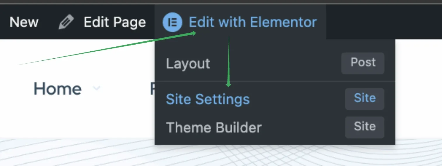
    The WordPress admin bar with the Edit with Elementor menu open — Layout (Post), Site Settings (Site), Theme Builder (Site) — and an arrow pointing at Site Settings.
  2. 2 Or open the Elementor menu

    Alternatively, edit any page with Elementor and click the hamburger icon in the top left corner of the panel.
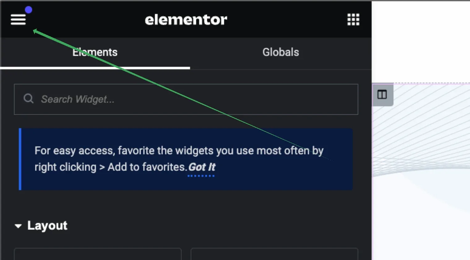
    The Elementor editor panel with an arrow pointing to the hamburger icon in the top-left corner, above the Elements and Globals tabs and the widget search box.
  3. 3 Choose Site Settings

    Then select Site Settings under Settings.
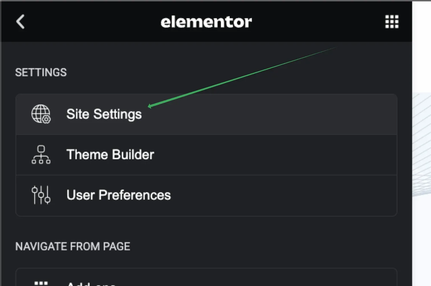
    The Elementor panel menu open on its Settings section — Site Settings, Theme Builder, User Preferences — with an arrow pointing at Site Settings.

Here's what you will see; the green box highlights options related to Listivo design:
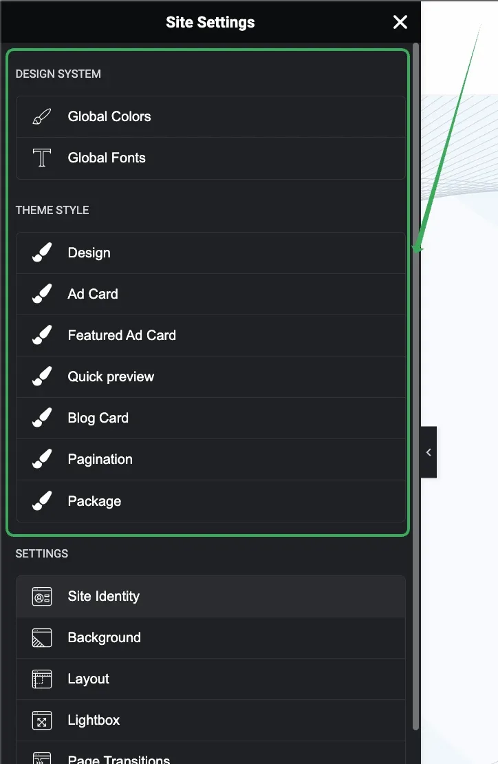
The Site Settings panel with a green box around the Design System group (Global Colors, Global Fonts) and the Theme Style group (Design, Ad Card, Featured Ad Card, Quick preview, Blog Card, Pagination, Package), above Elementor's own Settings entries.

You will have access to the following tabs:

1. Global Colors

Set global colors here. These colors are used by default in most widgets on your website. You can view this tab with a Style Guide Preview or without it.

a) With Style Guide Preview, it will look like the image below.
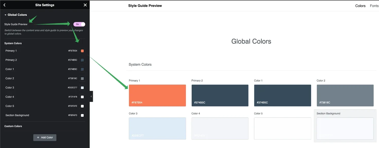
The Global Colors panel on the left and the Style Guide Preview on the right, showing the System Colors swatches — Primary 1, Primary 2, Color 1 to Color 6 and Section Background — with their hex values.

b) Without Style Guide Preview, it shows your current page and allows you to view color changes on a live preview.
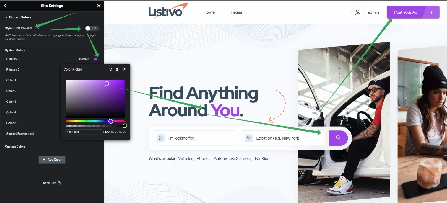
Global Colors with the Style Guide Preview turned off: a colour picker open over the live homepage, with arrows to the header button and the search button that use the colour being edited.

2. Global Typography

Here, you can set global typography.
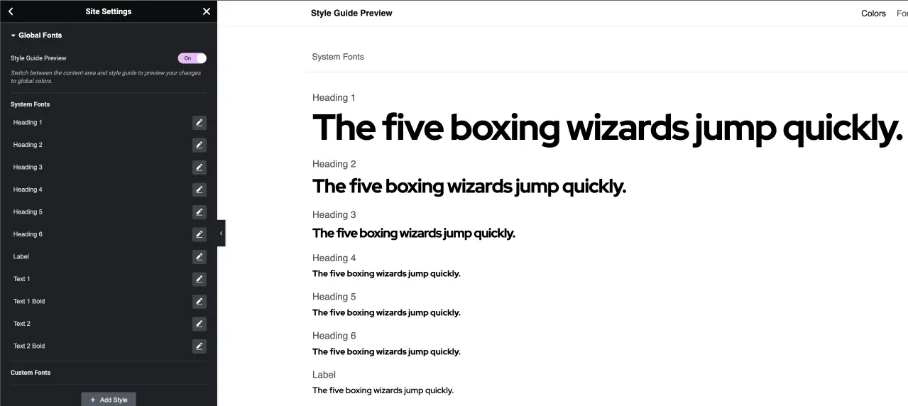
The Global Fonts panel beside the Style Guide Preview, listing Heading 1 to Heading 6, Label and Text styles, each rendered in the sample sentence "The five boxing wizards jump quickly."

Important settings in typography include:

  • Family (font family you use)
  • Size
  • Weight (some fonts allow variations in boldness)
  • Line Height (ensure it is higher than size for optimal readability)
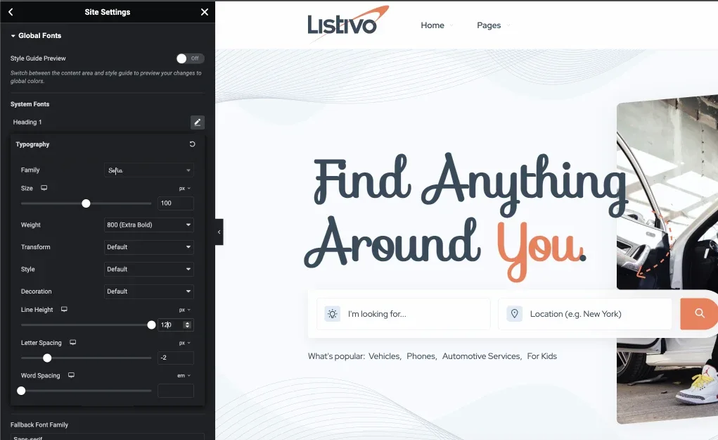
The Heading 1 typography controls — Family, Size, Weight 800 (Extra Bold), Transform, Style, Decoration, Line Height, Letter Spacing, Word Spacing — with the homepage headline previewed alongside in a script font.
A widget can override the global setting
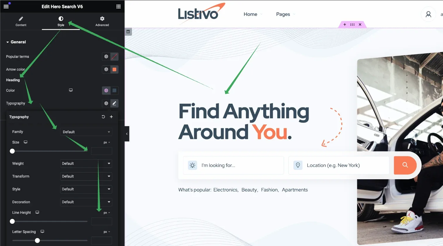
Most widgets on individual pages have their own styling options that override these global settings — as in the screenshot below, taken from a homepage edited with Elementor Page Builder rather than in the global design.
The homepage open in Elementor with the Hero Search widget selected; its own Style tab typography controls are open on the left and arrows point to the heading and search field they restyle.

3. Design

This general tab includes many options related to design such as border radius, buttons, and shadows. Explore these options to further enhance your site's aesthetics.
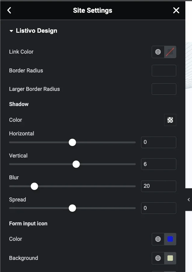
The Listivo Design panel: Link Color, Border Radius and Larger Border Radius fields, a Shadow group with horizontal 0, vertical 6, blur 20 and spread 0, and Form input icon colour and background.

4. Ad Card

Globally configure how ad cards look.
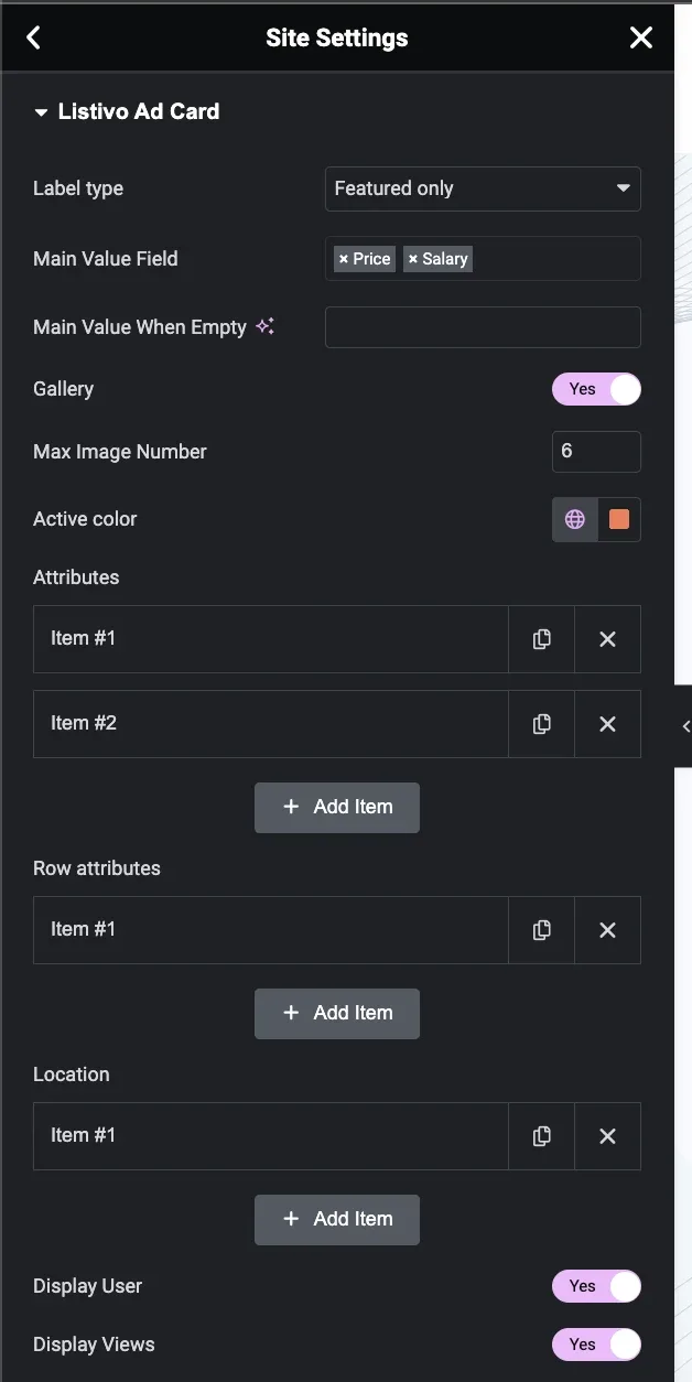
The Listivo Ad Card panel: Label type set to Featured only, Main Value Field holding Price and Salary, Gallery on with Max Image Number 6, Active color, Attributes, Row attributes and Location item lists, Display User and Display Views on.
Two things to know about the Ad Card tab
Some changes in this module require you to save and reload the website to take effect, as dynamic PHP code changes cannot be instantly visualized. And if you configure fields like attributes on your card, you have separate controls for standard cards and row cards — make sure to configure both if you use both types of cards.

5. Featured Ad Card

This setting builds on the "Ad Card" settings and allows changes to the styles and colors of cards that are featured, effectively overwriting them.
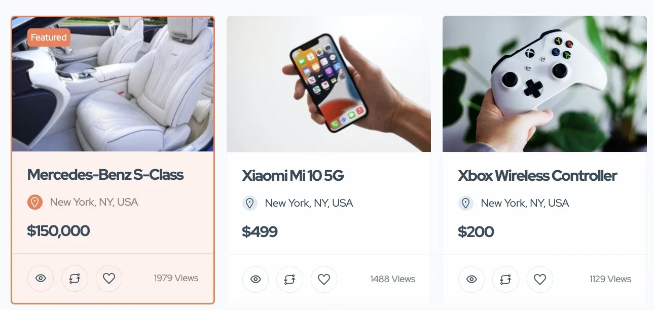
Three ad cards on the front end: the first, a Mercedes-Benz S-Class at $150,000, carries a Featured badge and a peach-tinted style, while the Xiaomi Mi 10 5G and Xbox Wireless Controller cards use the plain white style.

6. Quick Preview

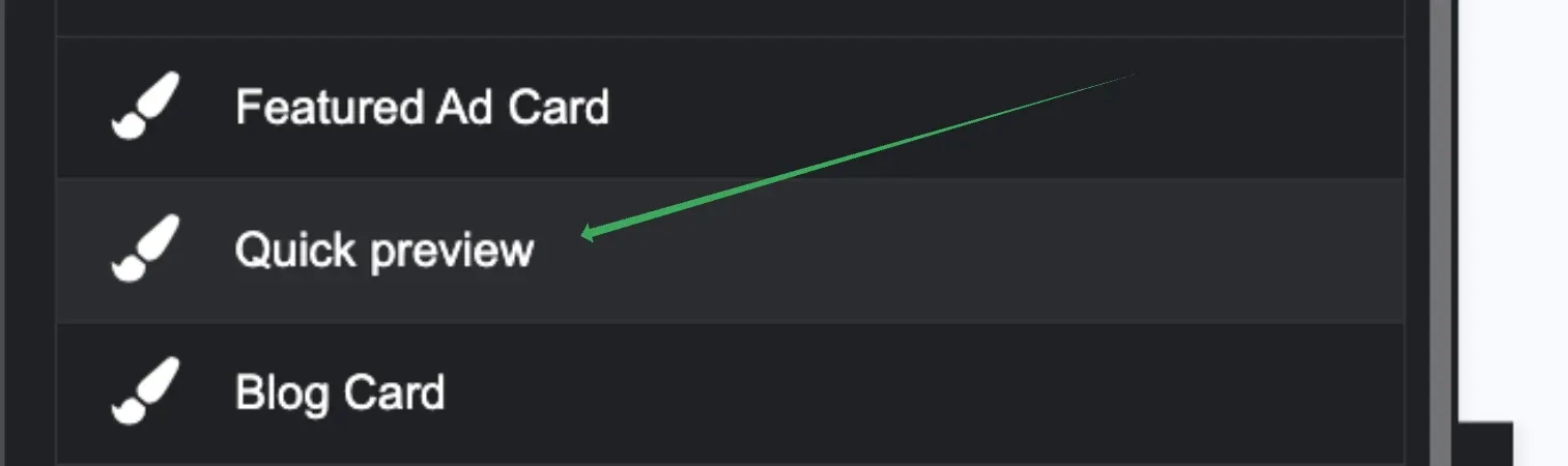
The Theme Style list in Site Settings with an arrow pointing at the Quick preview entry, between Featured Ad Card and Blog Card.

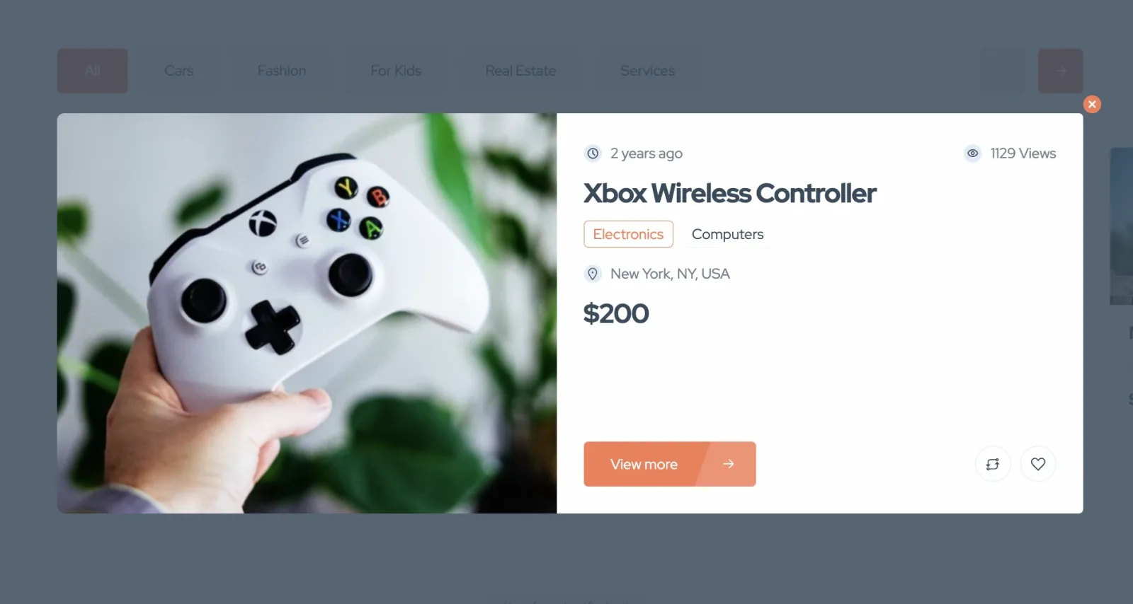
Refers to the module available on a card that opens when you click the loop icon.
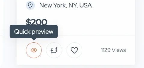
The bottom of an ad card: the eye icon is hovered and shows a "Quick preview" tooltip, next to the compare and favourite icons and a 1129 Views count.
The quick preview popup over a dimmed search page: a large photo of an Xbox Wireless Controller next to the title, the Electronics and Computers categories, the location New York, NY, USA, the $200 price and a View more button.

You'll find multiple options related to its style and display features here.
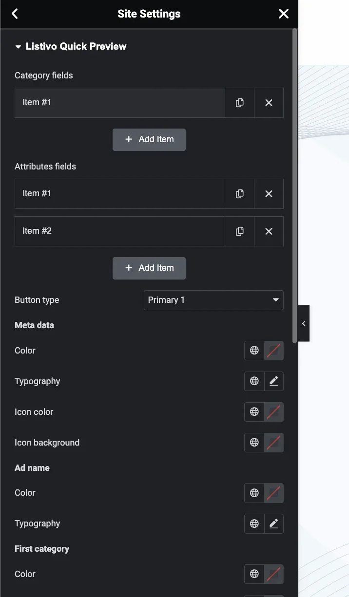
The Listivo Quick Preview panel: Category fields and Attributes fields item lists, Button type Primary 1, and colour and typography controls for Meta data, Ad name and First category.

7. Blog Card

Restyle blog cards as needed. This card displays in different contexts, like blog pages or related articles. Like the ad card, some options do not have a live preview and require saving changes in Elementor to see updates.
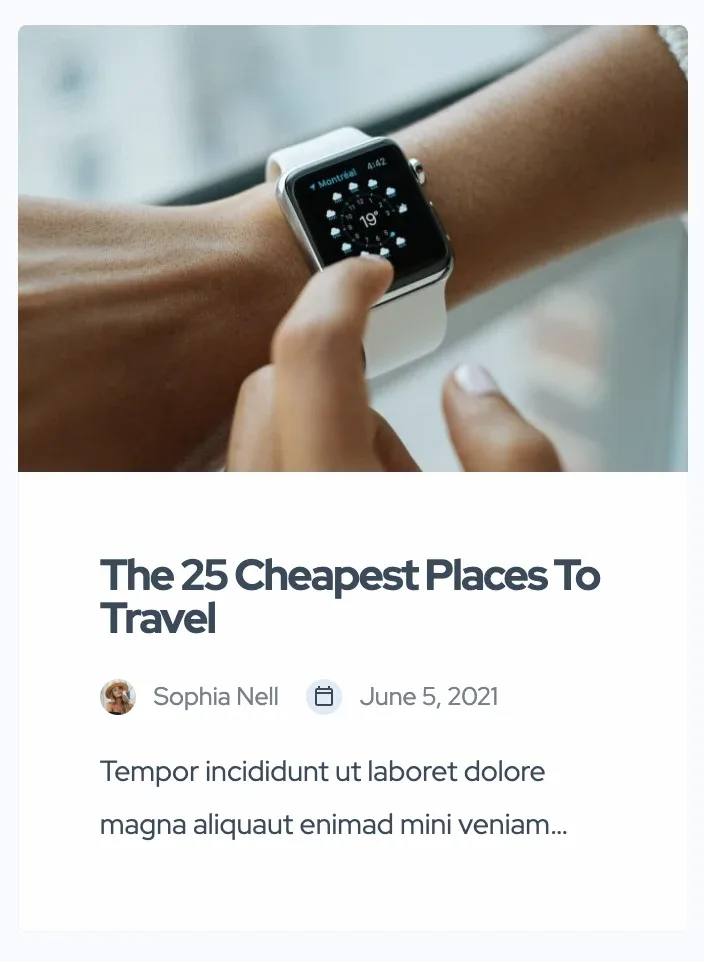
A blog card on the front end: a photo of a smartwatch above the headline "The 25 Cheapest Places To Travel", the author Sophia Nell, the date June 5, 2021 and two lines of excerpt.

8. Pagination

Influences various paginations across your website, such as on search pages, blog pagination, and other related areas like user panel pages.

A pagination bar reading "Showing 1 to 12 of 180 results" with page buttons 1 to 4, the current page filled in the accent colour, and a next arrow.

9. Package

Change how monetization packages appear in the pricing table.
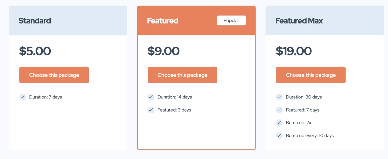
Three pricing cards — Standard $5.00, Featured $9.00 with a Popular badge, and Featured Max $19.00 — each listing duration and featured days above a Choose this package button.

This does not cover redesigning the "My Packages" section or choosing packages that a user already has.
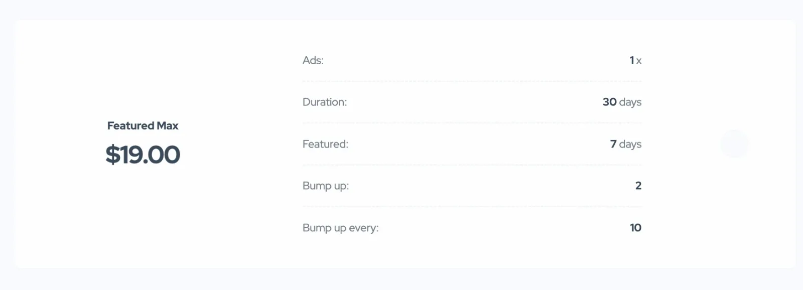
A package summary for Featured Max at $19.00 listing Ads 1x, Duration 30 days, Featured 7 days, Bump up 2 and Bump up every 10.

Ask the people who build Listivo

We answer by email from support@tangiblewp.com. With Premium Support, we also fix your site when something breaks.

Was this guide helpful?