Fixing Menu Collapse to Second Line: Expanding Width and Adjusting Mobile Breakpoints
Stretch the Listivo menu and set its mobile breakpoint so that extra links or longer labels stop dropping onto a second line.
3 minute read
This article explains how to correctly widen (stretch) a menu and set the mobile breakpoint. It is useful for those who want to add more links or longer texts to a menu without causing layout issues, such as content dropping to a second line, as shown in the example below:
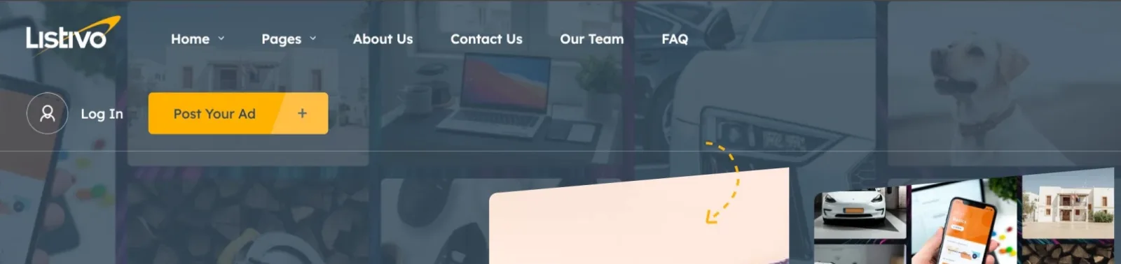
As illustrated above, adding additional links has caused the second part of the menu to collapse to the next line. This appearance is undesirable, as the menu was not designed to accommodate two lines and is considered poor UX practice.
If you plan to add more links or longer texts to your menu than what our demo example allows, you may need to adjust the width of the menu to prevent overcrowding and disrupting the design. The menu width does not automatically adjust to the number of links; you will need to manually set the desired width if it exceeds the demo example.
Improving the functionality of your menu involves adjusting its width to accommodate more text or additional links. Here’s how you can expand your menu for enhanced navigation:
-
1
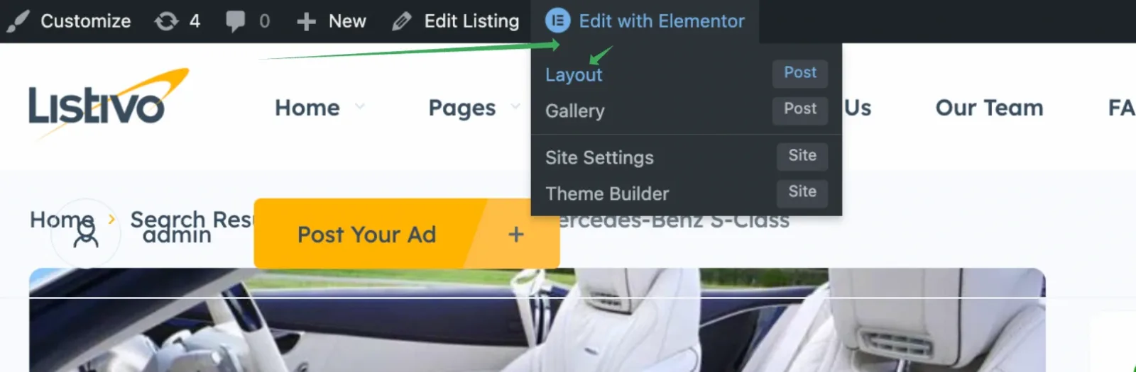
Choose a layout to edit
Visit any page, hover over "Edit with Elementor" and select Layout (this may be renamed on your site).
-
2
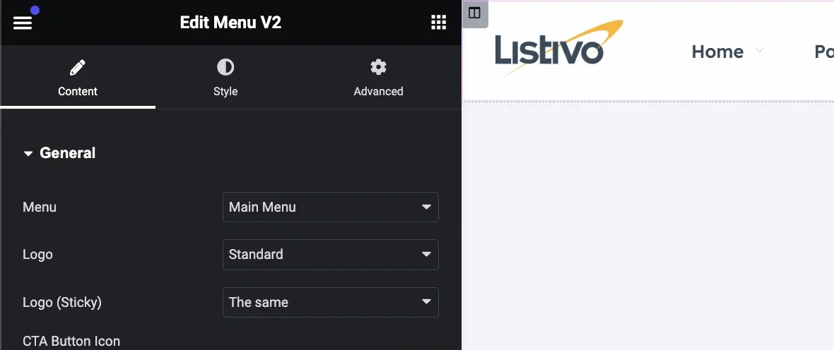
Edit the Menu Widget
Open the menu widget in the Elementor panel.
-
3
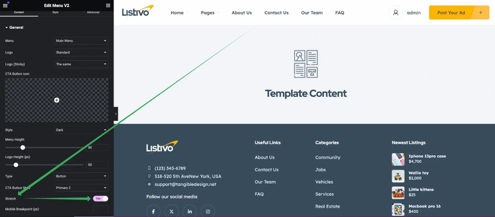
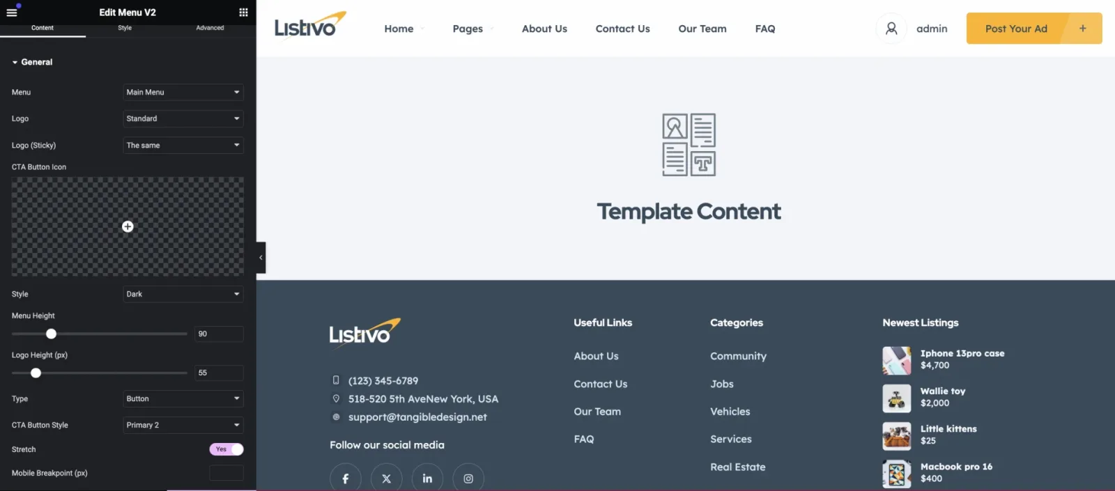
Enable the Stretch option
Stretch extends the menu from the left to the right edge, maintaining a default gap on both sides.
-
4
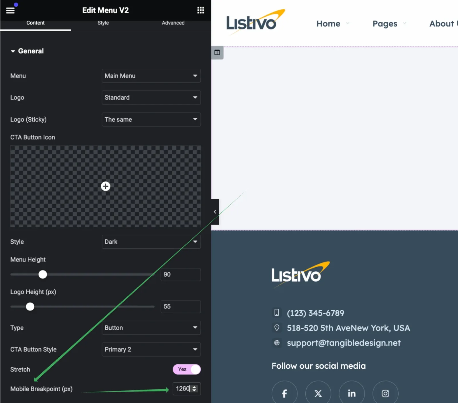
Adjust the mobile breakpoint
Set a breakpoint that suits your needs. It's essential to test this in browser incognito mode because in most classified ads websites, the Listivo Panel > Menu > "User Menu" option is turned on, and anonymous users see the "Login | Register" text, which typically appears longer than the text displayed when logged in.
-
5
Keep the desktop menu above 1260px
For optimal navigation on desktop devices, we recommend not using a mobile menu for screens wider than 1260px and limiting the number of links if it exceeds this width. Most desktops provide easier navigation with a full link menu rather than a mobile version. For instance, a typical small screen, like a small MacBook, has a browser window width of 1280px. Setting the breakpoint at 1260px ensures enough space for additional page scrolling without switching to a mobile layout.
-
6
Reduce the link font size if needed
If more space is needed to display links, consider reducing the font size of the first-level menu links to keep the menu compact and avoid triggering the mobile menu above 1260px. You can do this in the Style tab under Desktop Menu Item > Typography and change it, for example, to 13px.
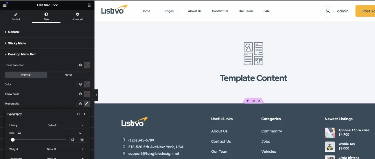
This approach ensures your menu is both functional and adaptable, enhancing user experience across different devices.
Ask the people who build Listivo
We answer by email from support@tangiblewp.com. With Premium Support, we also fix your site when something breaks.
We can also run your site for you, or build a new one.
Was this guide helpful?