How to change menu width?
Narrow the Vehica desktop menu with a CSS snippet, so the logo and menu items sit in a centred, fixed-width bar instead of stretching across the whole window — sticky behaviour included.
1 minute read
This article explains how to change the width of the desktop menu to a smaller size — 1160px plus two gaps of 30px on the left and right. It will look like this after the customization.
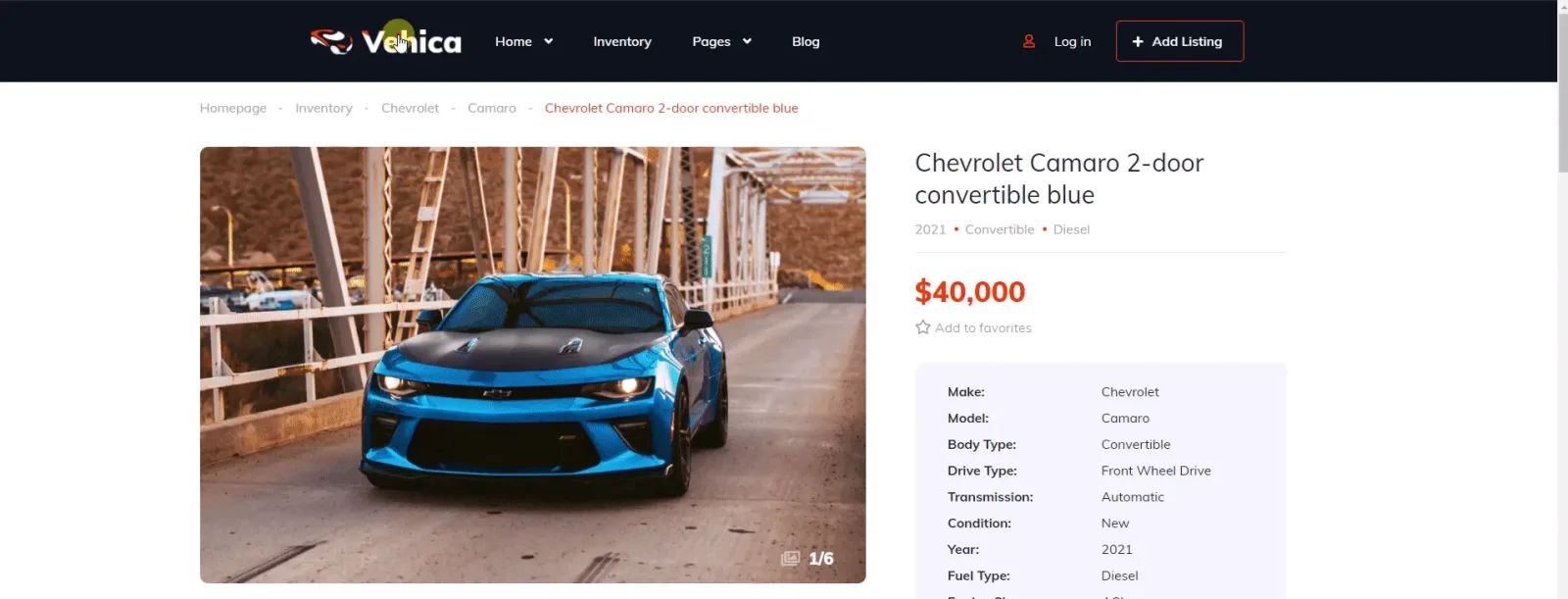
Please use the CSS code below. You can find instructions on how to add it here: How to add CSS code that is future update compatible
@media (min-width: 1200px) {
 .vehica-menu__wrapper {
   top: 0!important;
 }
  .vehica-menu__wrapper {
    max-width: 1200px !important; /* New Menu Width (including gap 2*30px both side) */
    margin: 0 auto !important;
    position: static;
    animation: none !important;
  }
  .vehica-menu__desktop {
    width: 100% !important;
  }

  .vehica-menu-sticky-active .vehica-header > div:not(.vehica-menu__transparent-wrapper) {
    height: 100px !important; /* Menu not sticky height (to prevent window jumping) */
  }

  .vehica-menu-sticky-active .vehica-menu__desktop {
    position: fixed !important;
    left:0!important;
    background: #fff !important; /* Sticky Background Color */
    height: 70px !important; /* Sticky Menu Height */
    animation: vehica-slide-down 0.5s;
  }
  .vehica-menu-sticky-active .vehica-menu__wrapper {
    position: relative !important;
    box-shadow: none !important;
  }
}max-width, the non-sticky header height, and the background colour and height of the sticky menu.Ask the people who build Vehica
We answer by email from support@tangiblewp.com. With Premium Support, we also fix your site when something breaks.
We can also run your site for you, or build a new one.
Was this guide helpful?